A year ago, together with Yahoo Labs, we released a dataset of 100 million Creative Commons Flickr images as a response to requests from many universities and research centers seeking real-world data.
Of the many papers and projects that now use the dataset, we were struck by one recent experiment by DataInterfaces at the ISI Foundation.
The Flickr Cities visualization looks at the 49 million geo-tagged photos in the open dataset and gives you a compelling and fun way to navigate and explore several cities. For starter, check out this heat map of Torino.

We can see where photos have been taken and zoom in and pan around. But that’s just the beginning. Lets look at London; by clicking on the controls on the right, you can make a rather difficult query.

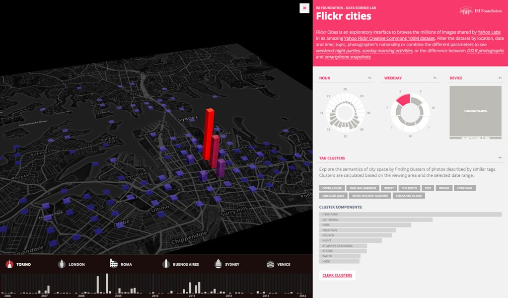
Above, we found a panorama of the Globe Theater by querying for photos taken between 1 and 2 pm, on a Friday or Saturday, with a smartphone. It gets even better. Flickr Cities also clusters tags based on geo-location and shows you a 3D bar chart of where photos with various tags were taken.
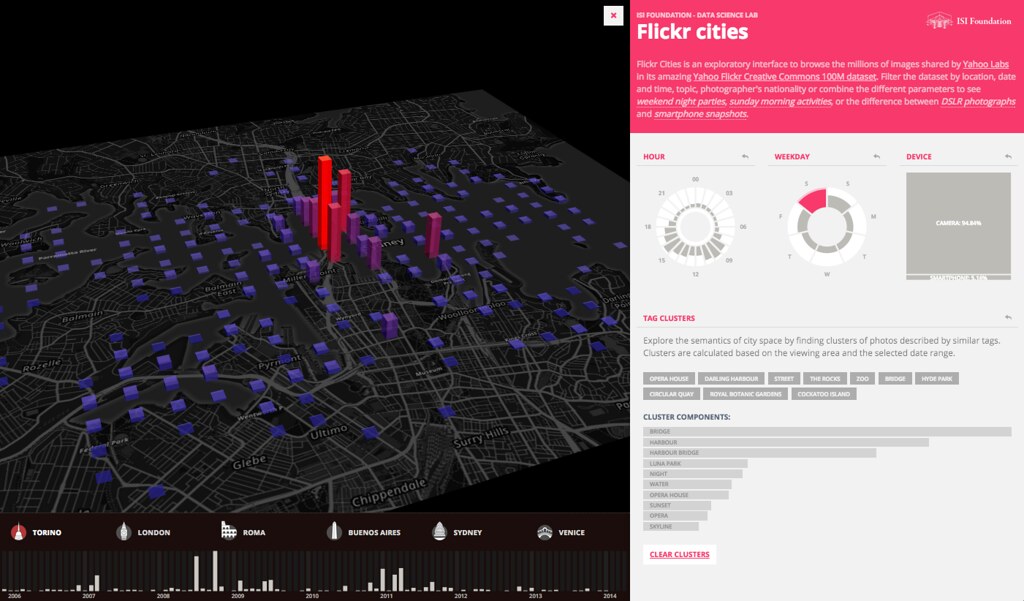
Above, we see where people take photos tagged “bridge” (of the Sydney bridge). Compare that below to where people take photos tagged “Hyde Park.”
We’re very excited about these experiments and look forward to seeing more! Oh and we did ask to see San Francisco in the list of Flickr Cities too.
You can try out the Flickr Cities project too.