Back in January, we announced some pretty big changes were going to happen this year. We’re hard at work to make your Flickr experience fresher, more gorgeous and super intuitive to use. It’s our goal to make the interface as streamlined as possible, so you can enjoy sharing your wonderful photography and exploring all of the awesome stories here on Flickr.
Justified View
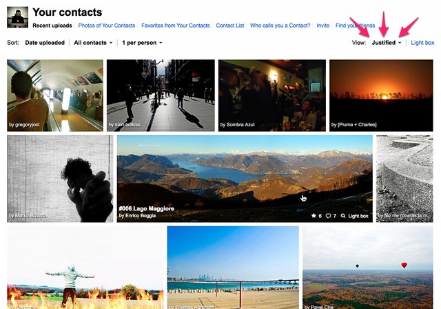
Today, we’re excited to introduce a new look for the Photos from your Contacts page, called the Justified layout. We created this new view to make it easier to see the stories your friends are telling with their photos. While the previous layout choices are still available, the new design optimizes for seamlessly displaying more images at larger sizes, so you can see more of the activity from contacts, friends and family at once.
Psst. Panoroma photos look particularly stunning in the new layout.
Needless to say, our Justified layout always respects the aspect ratio of the original image and will never crop your photos. We’ve also added quick access to comment on and fave directly on photos in this view, so it’s easier than ever to interact and engage with your friends.
We’ll be rolling out Justified view to all of our members over the next few days, so if you don’t see it right away, be sure to check your contacts page later this week.
Coming up!
The new Justified view will appear as a view option on other Flickr pages soon and is just the first of many changes we’re working on. A lot of improvements on core parts of the site are already in the pipeline and will be available over the course of the year. We hope you will keep telling us what you think as you start to see the new Flickr and letting us know what you enjoy and what we can do better.
We have created help forum threads for bugs you encounter and general feedback on the Justified layout and are looking forward to hearing from you.
