Cross-platform Flickr design language
The new Flickr user interface was crafted from the ground up to solve the pain points that exist in photography and photo management today – uploading, organizing, editing, and sharing.
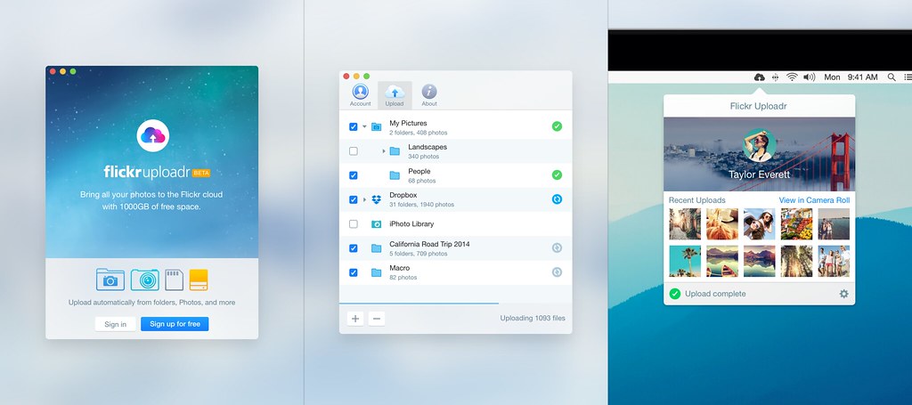
We’re on different devices and platforms at different times and we never want to think twice about accessing the photos we love and want to share. Flickr for iPhone, iPod, iPad, Apple TV, Android, and Web is now a unified design experience, working seamlessly wherever you are. In addition there are Flickr Uploadr apps for Windows and Mac OS, which allow you to quickly upload thousands of photos up to the Flickr cloud.
Refined, crafted, and vibrant, Flickr’s new design helps users understand the product as they use it, with new ways to experience gorgeous photography. The UX will help you find photos effortlessly, organize with hyper speed, make pixel edits without destroying originals, and share seamlessly with control over privacy.
Desktop Uploadrs
New native desktop Uploadr apps for Windows and Mac OS allow you to easily save your photos to the cloud from wherever they are stored: SD card, hard drive, iPhoto, Folders, Aperture, or Dropbox. Our Uploadr is easy, powerful, and highly customizable to support a wide variety of photo workflows.
Uploadr works in the background and delights with timely notifications – letting you know when photos have been found and taking you directly to them on the web as soon as they are uploaded.
New profile and Camera Roll
Flickr’s core management view has been upgraded to display and organize thousands of photos with ease. The user interface brings the tools to you when you need them. Start scrolling and a timeline scrubber appears, allowing you to jump back and find a moment in time.
Select photos and the action tray appears, giving you the right control at the right time. This simple, powerful Camera Roll is the new home for all your photos in the apps and on the web. With refined typography, consistent grids, and useful tools, your photos feel more organized and beautiful from every angle.
Removing friction from the photo management UX
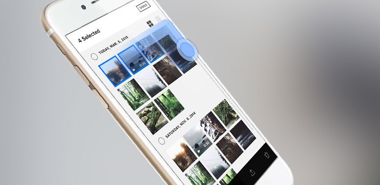
While Uploadr takes the work out of getting your photos into the cloud, selecting photos is the often the next cumbersome task. Most photo apps require users to tap or click on every photo a user wants to select. This kind of repetition is frustrating, so the Flickr team worked across platforms to refine the experience from hundreds of taps into one, multi-select, swipe gesture on mobile, and an easy to use click-and-drag experience on web.
Once photos are selected, the action tray appears, with tools to make edits, create albums, or quickly share, bringing the reward much closer to the intention.
In the edit mode on mobile, start swiping right and then down with one continuous gesture to select a range; feel free to refine with taps and swipes. And on desktop, click and drag within Camera Roll to select photos easily.
This new multi-select works beautifully on desktop, iOS, and Android.
Designed to find your photos effortlessly, anywhere
Unified search allows you with one query to quickly search your photos, photos from people you follow, and the billions of photos on Flickr.
Design and computer vision engineering teams worked together to innovate in the field of advanced image search. You can now search by a number of queries and quickly get results from your own photos, your friends, and the world. To refine these searches and get to the perfect image, a new set of filters on web brings primary color search to all your photos and the entire corpus. Users can also combine color filters and aesthetics like minimalism, and depth of field. Flickr’s vision search engine recognizes patterns and “understands” what objects and aesthetics are in every image.
These advanced features are now accessible from one interface, drastically reducing the number of clicks it takes to perform advanced filters like creative commons, orientation, size, and so much more.
Beautiful images, readable text
The cross-platform Flickr design language is approachable and timeless, focusing on legibility and usability. We’ve clarified areas of the experience that are story-driven – such as comments, descriptions, and organization – with lighter backgrounds across the apps, while the photo-centric lightbox and pixel-editing experiences live on a dark canvas, so that the focus stays on the photo.
These two essential styles are carefully balanced to work in harmony and help users navigate, organize, enjoy, and share photography in the best light.
The home for your photos
As we work to revolutionize the way you upload, organize, and share every photo you’ve ever taken, we know we need to deliver on a seamless, consistent experience across devices. Today, we’re bringing you just that, from iPhone to iPad to Android to Web, and now desktop. The new features and elegant design allow you to enjoy your images and your memories from any device, anywhere in the world.


