After nine years of diligent service, it’s time for us to bid m.flickr.com adieu and say hello to the mobile-ready www.flickr.com!
The mobile web has come a long way since we first introduced m.flickr.com, and nowadays there are better ways to build web pages for mobile devices. In fact, the pages we’ve redesigned in the last few years have been mobile-ready from day one. Streamlining the existing mobile pages lets us improve and enhance our mobile web experience at a much quicker pace.

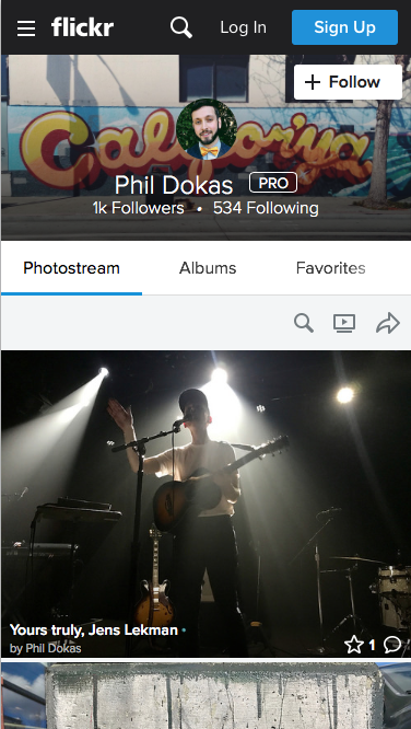
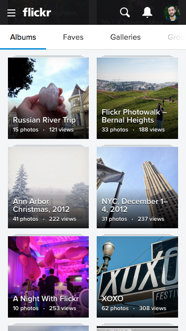
With this update, when you visit Flickr on a mobile device, you will now see all the pages you would have accessed through the pared down m.flickr.com as a fully responsive experience. Instead of small thumbnails and text-heavy pages, you’ll get a much nicer layout scaled to fit your device. All of your old bookmarks should work normally, as should links around the web. Anything anyone shared with you over time will remain intact and function as intended.
We hope you’ll like the new mobile experience and we invite you to share your feedback with us in the Help Forum.